How to create a memorable brand and interior
Take time to consider your whole brand story, try not to follow dull trends and remember to be bold, say Anna Burles and Chris Trotman
People respond to good design even if they can’t tell you why. If you commission a design studio to create an interior and brand for you, it could cover anything from the colour you have painted on your walls to the illustration at the top of your menus. Here’s a guide to seeing the process through, from conception to execution.
Start with a good brief
Make sure you start the design process on the right footing. Think about your vision, your objectives and your brand story when talking to designers about what you want. Ensure everybody is on the same page and only sign off when you’re happy.
Trendspotting
Immerse yourself in your niche. Visit your competitors, locally and virtually, in hotspots such as London, Melbourne and New York. See if there are any trends you want to avoid or cultural contexts that you respect. However, blindly following trends is lazy and could date your project – for instance, why should all Greek restaurants be blue? Be unexpected, be bold, take risks and, most importantly, do not copy.
Joined-up design
Make sure the branding team and the interior design team are talking to each other – ideally creating concepts and designing simultaneously. Working collaboratively, so that every touchpoint can be carefully considered, means the interiors will inspire elements of the brand, and the brand will become embedded in the interiors. This will help create a cohesive visual language for both brand and interior, making their impact more powerful.
If the brand already exists, allow for some flexibility within any guidelines when taking it into a physical space for the first time. For example, colours that are impactful on websites or printed materials might not translate so well in a restaurant with a laid-back vibe. The brand colour palette doesn’t need to be the same as the interiors, but ideally they would be aware of each other. Sometimes it works well when they are harmonious or are cleverly connected by a muted tone. If the brand colour is bright yellow, that doesn’t necessarily mean you should have yellow banquettes. Make sure you have a relaxed approach to the materiality of ‘branded’ elements, like logotype signage and wayfinding.
Building a brand world
Develop a comprehensive brand identity (not just a logo) that encompasses typography, a colour palette and a rich brand ‘world’. Have a library of assets, which could include photography, illustrations, patterns or any other devices used across all touchpoints – from menus and other printed brand materials, but also seamlessly integrated into the interior design, such as on custom-designed materials, finishes and even furniture and decorative lighting.
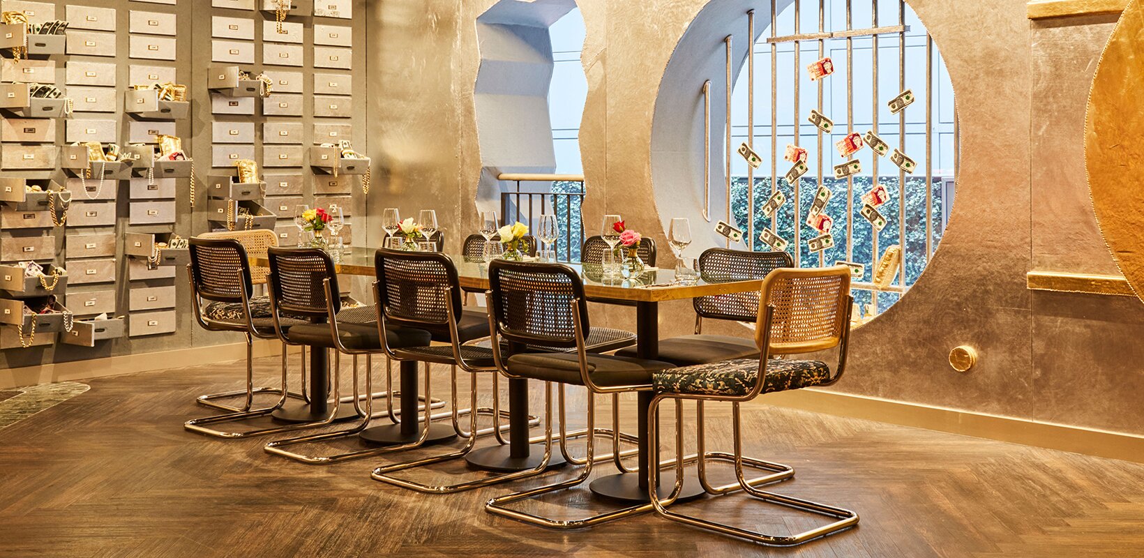
Invisible branding Brand inspiration can come from decorative elements within the interior scheme, such as shapes and forms, and vice versa, where brand imagery can make its way into bespoke fabric patterns, infusing a space with what we like to call ‘invisible branding’. However, this doesn’t mean sticking logos everywhere – the word ‘brand’ is used very loosely to cover the more artistic touches we like to inject into the spaces we create.
Consider bespoke wallpapers or a collection of custom framed art, or subtly using illustrations created for the menus and website.
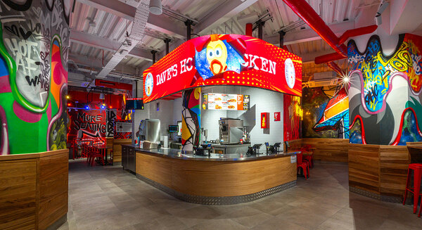
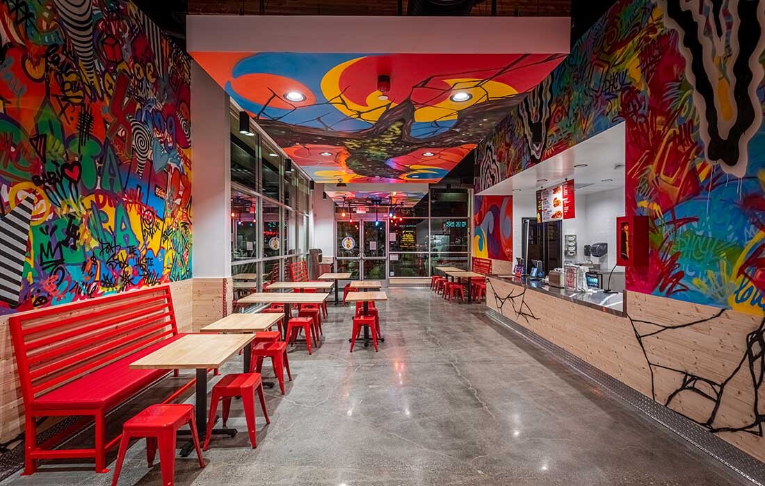
You can display neon installations of music lyrics that channel the spirit of the brand, or commission handpainted murals made from key colours from the interior colour scheme. This will all help create an evocative brand and interior experience.
Storytelling
Inject thematic elements into the design that tell a story and evoke emotions. Try creating a character or a back story to make it as authentic as possible and play around with their story. Make your customers feel like they’ve gone to another world, such as a downtown secret speakeasy, the bustle of India or a Caribbean island. Use artwork and decorative props that align with the brand narrative, and make the staff part of the story by way of uniform or their tone of voice.
Anna Burles and Chris Trotman are founders of design studio Run for the Hills


